Common Web Design Mistakes
Simple layout and design tips to help you create a stunning webpage

Thousands of people across the globe create websites on Tilda. This article is based on recent research by my colleagues and me. We analyzed common mistakes that people make when they create websites using our platform. Here is a list of the dos and don’ts applicable to any web design tool or service you use.
Common Landing Page Design Mistakes
1. Content is not broken down into logical blocks
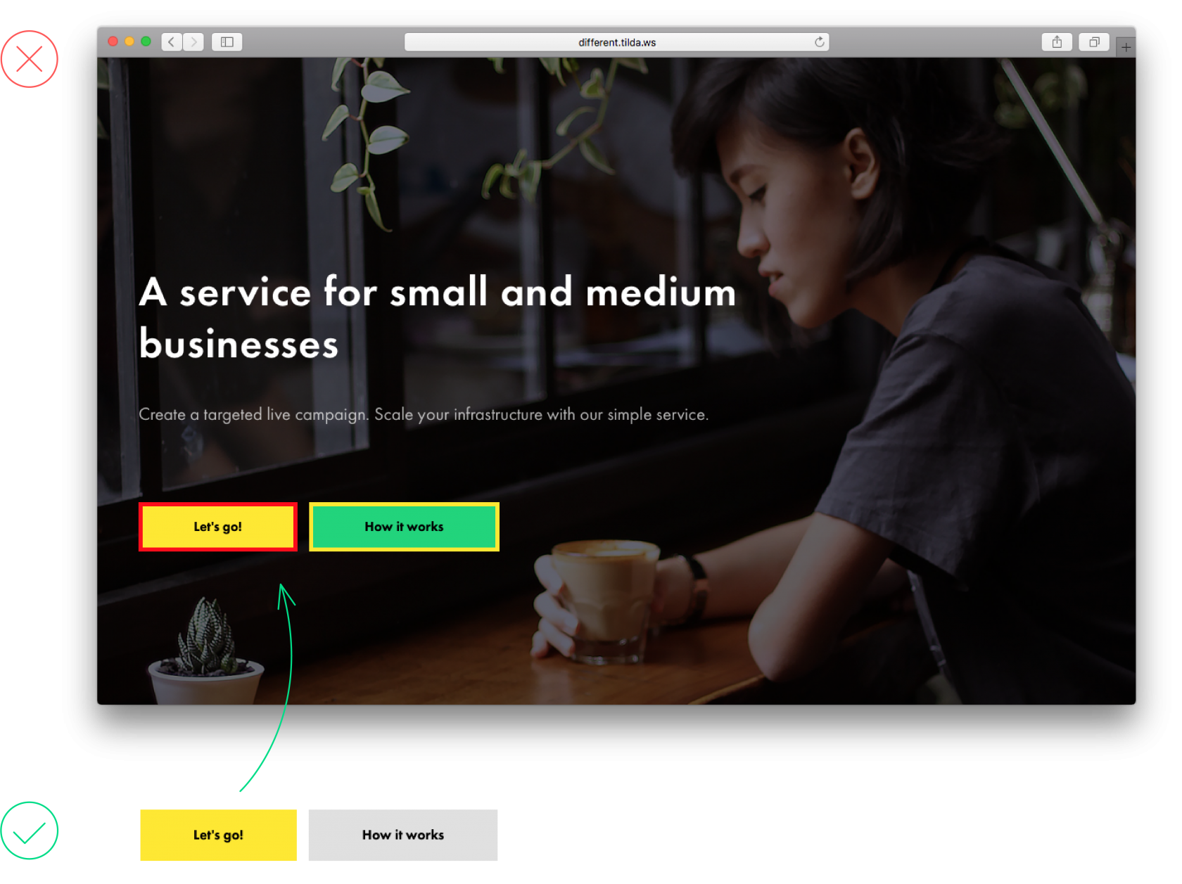
It is easier for users to digest information if it is grouped into logical blocks. Set the padding to 120-80 pixels and separate blocks of text by using color backgrounds.
There is little padding between sets of related information. Moreover, this design needs color blocks to divide content into logical sets. As a result, this information is hard to digest, and it is unclear which text should go with each block
Paddings are large enough, and the blocks are separated by color, which makes one thing immediately clear — these blocks contain different types of content
2. Uneven spaces between items on a web page
Same-size spaces should be set around logical blocks. Otherwise, your page will look messy, and users may not give equal consideration to each section.
Spaces of various widths look uneven and create an impression that company information is linked to the header, although every block is equally important
Same-size spaces around headings and the body copy help perceive the logical blocks as carrying equally important information
3. Padding is too small – users cannot break down content into logical blocks
To avoid logical parts from blending in, keep them separate and insert a large space (at least 120 pixels) between them.
Narrow padding makes blocks stick to each other. This overloads the page and is quite confusing — a website visitor is led to believe that this is one solid piece of text and not different parts
Padding is large enough, so the difference between these two blocks is immediately visible
4. Low contrast for text copy on an image
There should be sufficient contrast between text and background. To make copy prominent, place a contrasting filter over the image. Black is a popular color but you could also use bright colors and mix and match them.
Another option is to use a contrasting image from the start and placing the copy on top of a dark section of a photograph.
Another option is to use a contrasting image from the start and placing the copy on top of a dark section of a photograph.
This image is too light, which makes the text difficult to read
A filter applied to the photo makes the copy easy to read
5. Too many styles on one page
Too many typographic and design styles on one page make it look unprofessional and hard to read. To avoid this, limit yourself to a single font and two weight options. For example, normal and bold.
Because of too many typography styles beings used, it’s unclear where the emphasis lies
One font, one color, and two weight options. The typography on the page looks neat and clear
6. Block with a colored background is too narrow
Avoid emphasizing narrow page elements with color. It just doesn’t look good. For example, headings are already well-marked, thanks to their size, font weight, and paddings. Would you like to highlight a particular point on a page? Use a color background for the entire block, including a related heading and text copy.
Headings placed on a color background break up the page’s continuity and look like separate, independent elements
Both the heading and related text copy share the same background. It shows they belong to the same logical set
7. Too much text copy inside narrow columns
It is difficult to read when there is a lot of text copy in narrow columns because website visitors have to skip from one line to the next. Also, it just doesn’t look good! It’s best to cut on the number of columns and shorten the text copy. Otherwise, nobody will read it.
Long, outlined columns are hard to read
There is little text in these columns, so it’s easy to read
8. Too much centered text
Centering text on the page works well when there is little text, otherwise, it’s hard for users to navigate it efficiently. At the same time, increase the font size starting from 24 pixels.
If you need to include a lot of text, use the blocks featuring collapsible text copy (on Tilda, use blocks TX12, TX16N, or the button BF703).
If you need to include a lot of text, use the blocks featuring collapsible text copy (on Tilda, use blocks TX12, TX16N, or the button BF703).
Long, centered texts are not easy to read
A short piece of text under the heading (both centered) looks good on a page
9. Text copy is superimposed over an essential part of an image
Avoid covering meaningful parts or small details of an image with text. This way, you will both obscure the image and make the text illegible. Try different positions for the text lines, such as centered, left-aligned, or even vertical placement.
This heading gets in the way of the woman’s face. With so many tiny details, it’s hard to read the text
The image and text copy are easy to read and form good composition
10. Misusing visual hierarchy
For information hierarchy to be clearly visible on a page, the title on the cover should be bigger than the rest of the headings or at least the same size. This is especially true if the heading is long, for example.
The heading on the cover page is disproportionately smaller than the following heading, which is confusing. Why? It makes the second heading appear more prominent
The heading on the cover page is bigger than the one in the following block, so the page looks consistent
The same principle applies to visual hierarchy within a logical block. The heading should be the largest design element on the page, followed by a smaller, less prominent subheading. Next, feature titles that follow should be noticeably smaller than the heading and of the same weight. The smallest fonts should be used for feature descriptions.
This will help website visitors distinguish between the more important and less important information.
This will help website visitors distinguish between the more important and less important information.
The heading is smaller than feature titles and seems less significant, although it’s more import in this context
The heading is the most prominent element on the page and despite feature titles are written in a smaller type, they are still clearly visible
11. One logical set is split into two
A full-screen image or gallery following a piece of text resembles a separate, independent block. If you add padding around the gallery, both text copy and images will look like a logical whole, thanks to a shared background.
A full-screen gallery looks disjointed from the heading above and looks like a standalone block
The gallery shares the same background as the heading right above it, which makes the whole composition look solid
12. The heading is too large and too long
A very large font is perfect for a short sentence. If the heading is long, use a smaller size font. This will make it easier to read and leave plenty of space for all other design elements on the page.
The heading that is too big takes up the entire cover, while design elements jostle for space and the heading is hard to read
This page is well-composed, all the design elements are in balance with each other, and the copy is easy to read
13. Wrong use of border styling for buttons
Borders are necessary when a button is transparent. Adding a border for a color button does not make sense. It’s just another meaningless design feature that overloads a page and makes it difficult to read it.
14. Too many colors
Using too many colors on a page is confusing. Also, it’s unclear which bits are more important. One or two colors are enough to give visual weight to what’s really important.
There are too many bright colors on the page; this is confusing
One color accent creates variety and doesn’t distract from the content of the page
15. Overloaded menu
People visit websites to find solutions to their problems, help them! Use the menu to help people navigate the website and find what they need quickly and easily. Don’t overload them with excessive information. It’s enough to have 5 to 7 menu items.
This menu carries too much information, making website navigation more difficult
A simple menu makes is easy to find what you need
Common Editorial Web Design Mistakes
1. Long and solid text
A wall of text makes reading difficult to understand. For easy navigation, split it into paragraphs or introduce breaks such as impact phrases, quotes, or an images.
A wall of text is hard to look at
Elements such as quotes or images make it easier to go through the text
2. The heading is positioned at the same distance between two paragraphs
A heading should not "hang" between chapters at a similar distance because it belongs to the paragraph that follows. The spacing above a heading should be 2−3 times bigger than the space under it. Simultaneously, the distance under a heading should be roughly the same as the space between paragraphs or slightly larger. This way, the heading will visually refer to the subsequent text.
The heading is positioned at an equal distance between paragraphs above and below it, and it’s unclear which paragraph it belongs with
Thanks to the use of padding under the heading, it’s obvious that the heading belongs with the text that follows
3. No logical order
In typography, contrasting is used to visually divide different levels of text and establish a strict hierarchy. Main headings should be the most prominent on the page; subheads should be considerably smaller but still clearly visible.
The heading and subheading are about the same size, there is no clear hierarchy
It’s clear that the heading is more important than the subheading
4. Different spacing above and below blocks
If blocks carry the same weight, they should have the same look and feel and be positioned at an equal distance from each other.
If the space between the heading and an author’s image is too narrow, it looks as if the author has more to do with the heading rather than the text that follows
Thanks to the same spacing above and below the image, blocks appear equal
5. Caption is positioned too close to the image
On the one hand, the illustration and its caption form a single whole, but these are two separate elements, and captions should not interfere with the image.
The caption is stuck to the image and interferes with perception (both the picture and the text)
There is a lot of white space between the image and its caption, yet it’s clear that the caption belongs to the image
6. There is too little space between the subheading and the paragraph
The subheading and the text that follows it belong together, but if the space between paragraphs in an article is greater than the space between the subheading and the next paragraph, the article looks disjointed.
There is less space between a subheading and a paragraph than between the paragraphs themselves
The spacing under the subheading is slightly larger than the spacing between paragraphs
7. Stand-out elements are placed too close to the main text
Elements used as expressions of emphasis such as key phrases or quotes are independent objects. To make them really stand out, set them 75-120 pixels from the main copy.
There is too little space between the main text and stand-out elements
The quote really stands out thanks to the large padding
8. Low-contrast elements
If you’d like to emphasize a certain phrase, be bold, make a key phrase bigger than the main text by 10−15 pixels. Let the key phrase really stand out from the rest of the text.
Key phrase blends in with the rest of the copy, it looks messy
Key phrase stands out well with its large font size and sufficient spacing around the text
9. Color background for a narrow text block
If you want to highlight a small section of the page, such as information about the author, you just need to set sufficient padding around it to create the impression of space. Don’t place place this section on a colored background; it will look out of place.
Don’t use color for the subheading. The use of a larger font and padding should be sufficient to make it stand out on the page
10. Empty space between two full-screen images
When you are using several full-screen images in a sequence, avoid leaving a space between them. The border will still be visible, and there is no need to add an additional element. It just doesn’t add anything, it’s meaningless.
White space between fullscreen images doesn’t make sense and doesn’t look good
There is a harmonious flow between images in this example
11. Too many design accents being used
Design accents (such as boldface here) work well when there are few of them. Put in too many, and this will get in the way of reading the page.
Many words are marked in bold, so the text copy appears broken
A few marked words grab attention and do not interfere with the rest of the text
12. Too many typography styles
Design should not interfere with readability. The fewer typography styles there are, the better important elements are visible. It’s enough to emphasize headings and subheadings and use contrast for key phrases.
There are too many typographic devices in this text; they distract the reader
Very few typographic styles, clear accents and adherence to text hierarchy
13. Centering text in a long article
Centering is usually applied to headings and quotes to distinguish them from the rest of the text. A center-aligned long piece of text is difficult to read.
Centered text looks messy, it’s hard to read
Left-aligned text is easy on the eye
14. Heading is too close to the image
A heading is an individual design element. It should not be placed too close to an image that follows. For a winning combination, set padding at no less than 60 pixels, and add a subheading: it will unfold the page’s contents and place the right emphasis where it needs to be.
The heading is too close to the image, there is no "air" on this page
The heading is separated from the image by a subheading and refers to the entire section, not just the image
15. Unnecessary use of italics
Italics are used to emphasize a word or short phrase in the text. It is not as immediately noticeable as the bold type, but it allows for emphasis where needed.
Don’t use italics for your body copy and headings. And if sans-serif fonts are used in the text copy, avoid italics altogether.
Don’t use italics for your body copy and headings. And if sans-serif fonts are used in the text copy, avoid italics altogether.
The phrase stands out due to the font size and spacing, so italics are not really needed here
Italics are in the right place, adding the right amount of emphasis
16. Blocks are shifted relative to the center and each other
You can spot this annoying mistake yourself if you take a small break after editing your page (changing font size, alignments, or spacing) and take a fresh look at the result.
In this example, the heading is shifted to the left, and the text is shifted to the right
All text elements are in harmony with each other
If you enjoyed this article, please share it with your friends! Thanks ✌️
See also:
Free coursebook on how to design, set up, and run
high-conversion landing pages
high-conversion landing pages
Free practical guide to web animation with examples, techniques,
and tips on how to use them

